Aoibheann Hand
aoibheannhand@msn.comOh so...
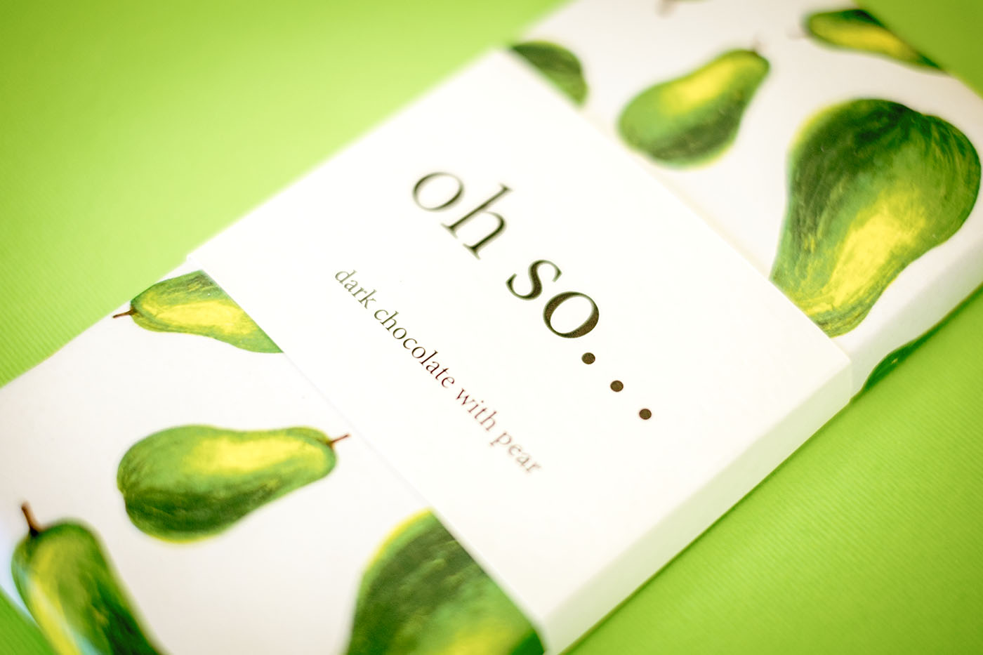
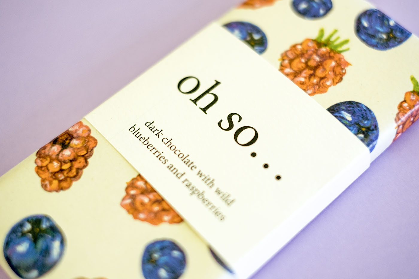
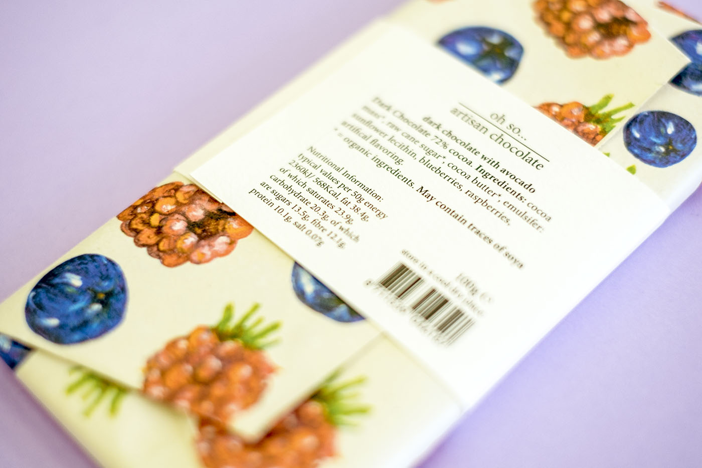
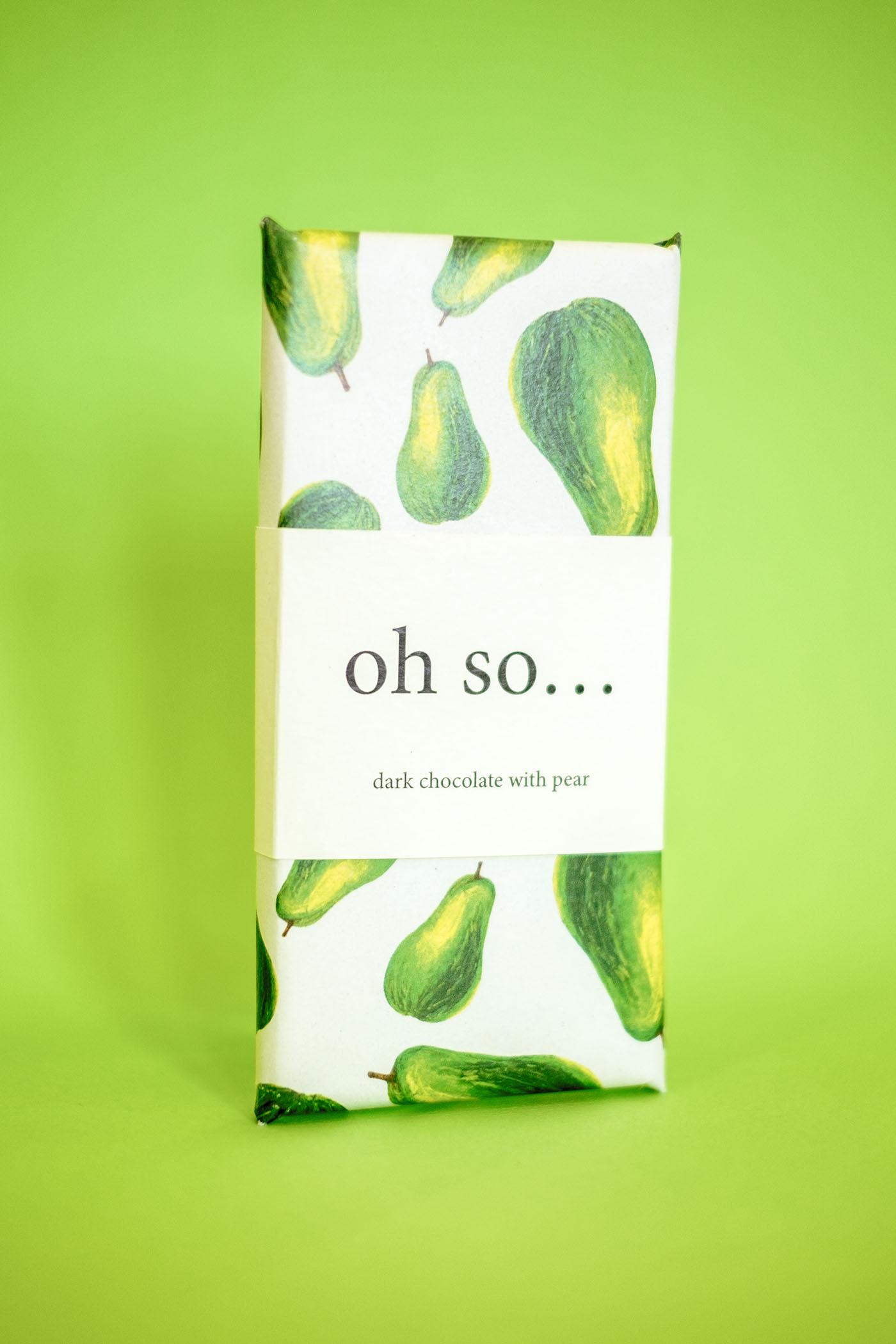
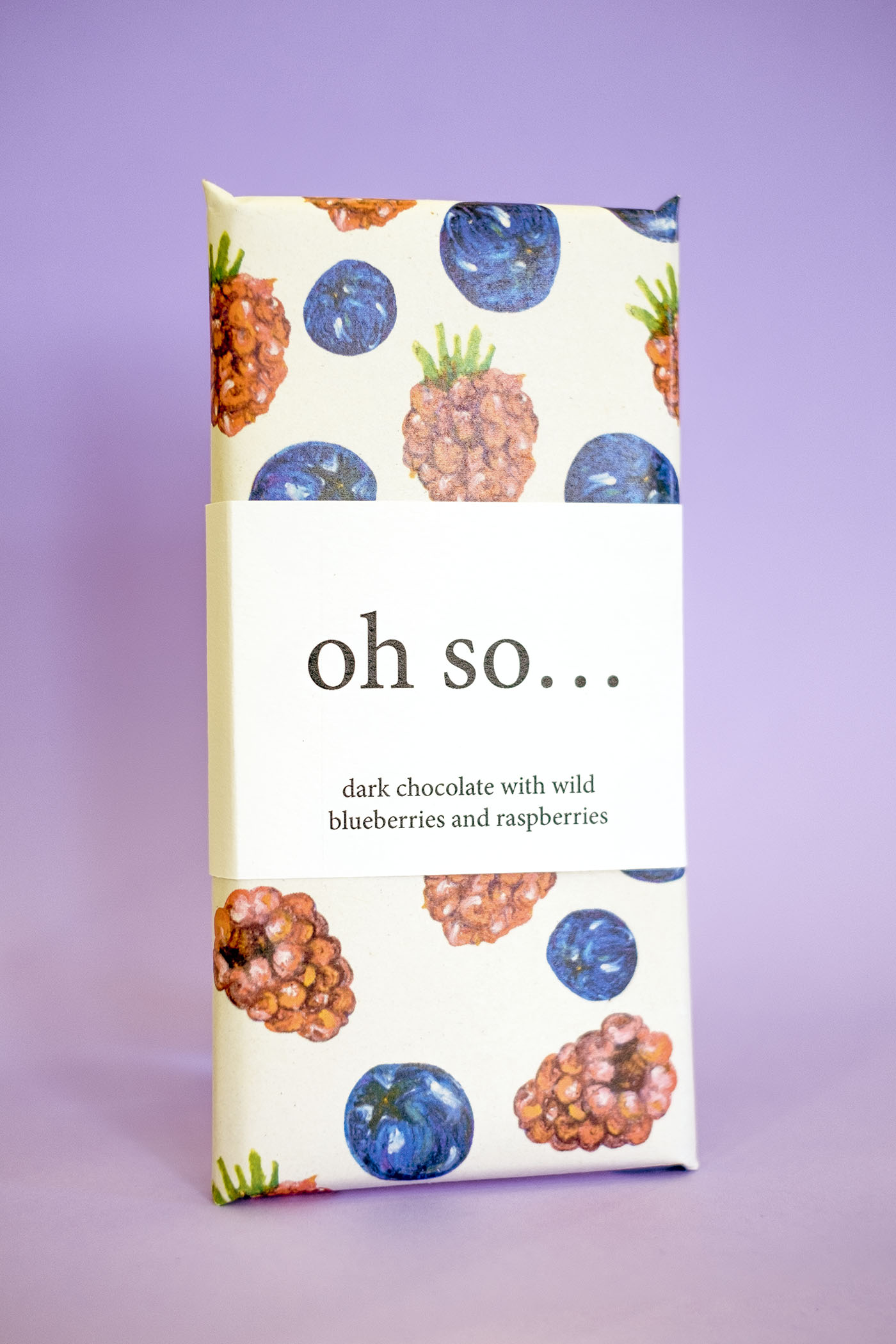
This project was to invent a suitable name for an artisan company and design the packaging and logo for their range of fruity dark chocolate bars. The name I chose was 'oh so...', as I thought it had a lot of potential down the line, for other different ranges of chocolate in the future. The drawings found on the outside of the packaging were drawn with oil pastels, capturing and displaying the bright colours found in the fruits and its textures. The outer layer of packaging is made with tissue paper to give that natural touch and feel when in your hands. All information regarding nutritional values, ingredients, etc can be seen on the back of the label band that is found around the middle of the chocolate bar. The design is to promote healthy eating in a unique and appealing way.
