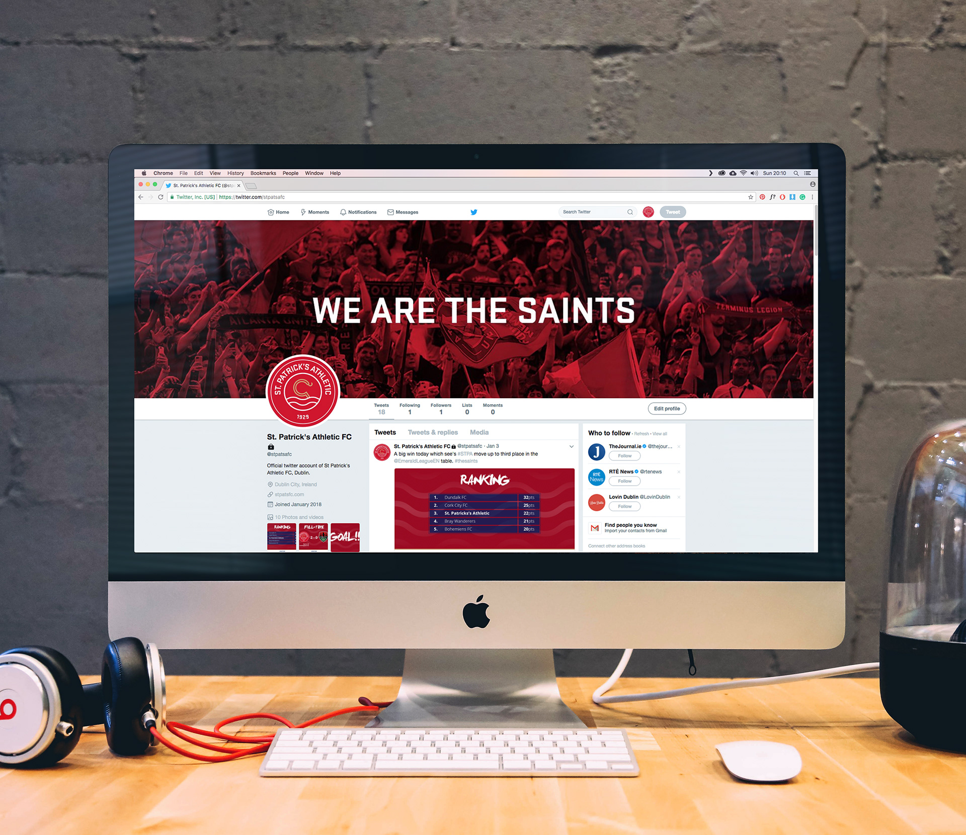
St. Patrick’s Athletic
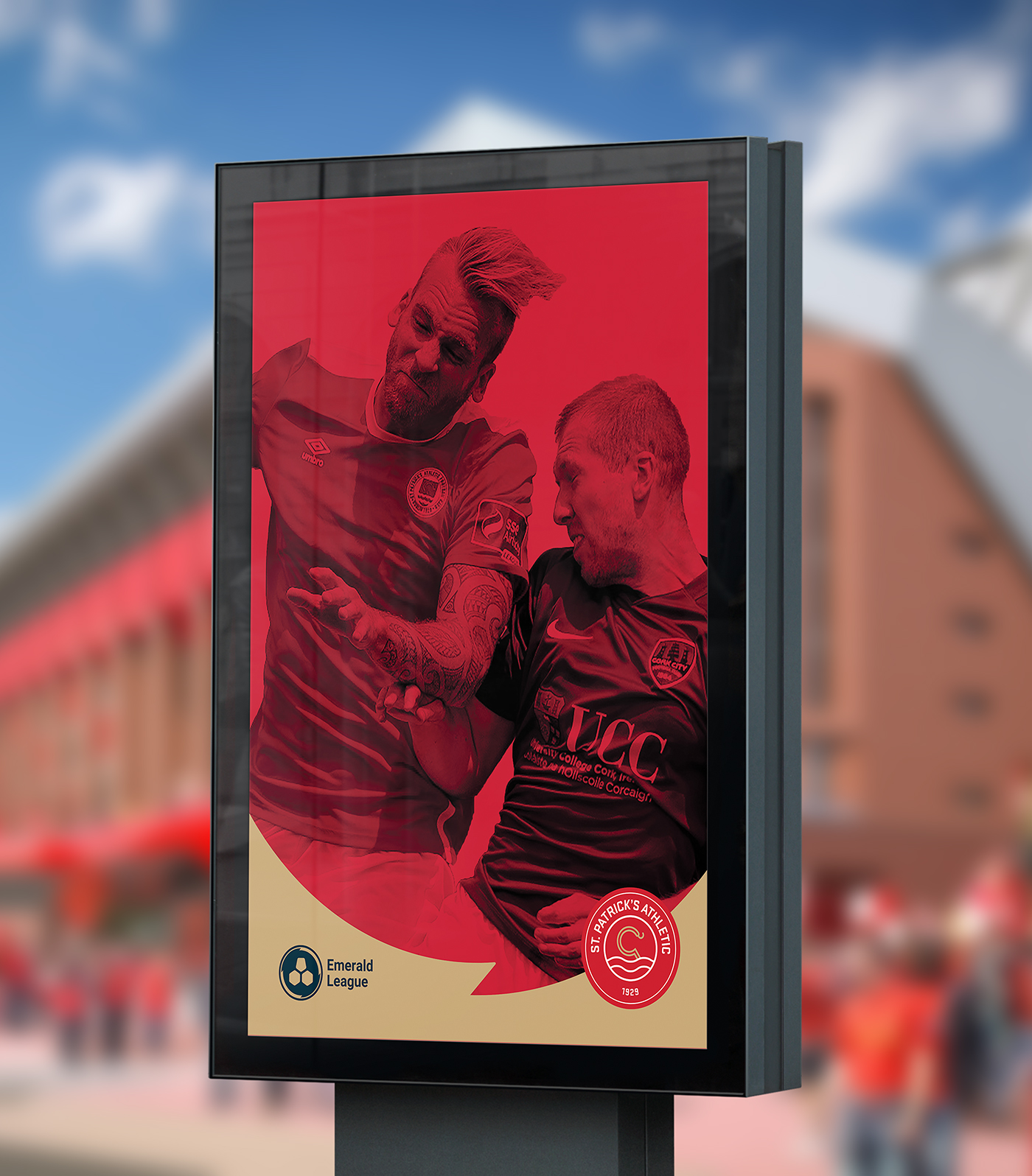
The aim of this project was to show how investment in the League of Ireland brand could help change the perception of the league and its clubs. To this end, I rebranded the League of Ireland as the Emerald League and showcased how a club (St. Patrick's Athletic) would work within that new identity system.
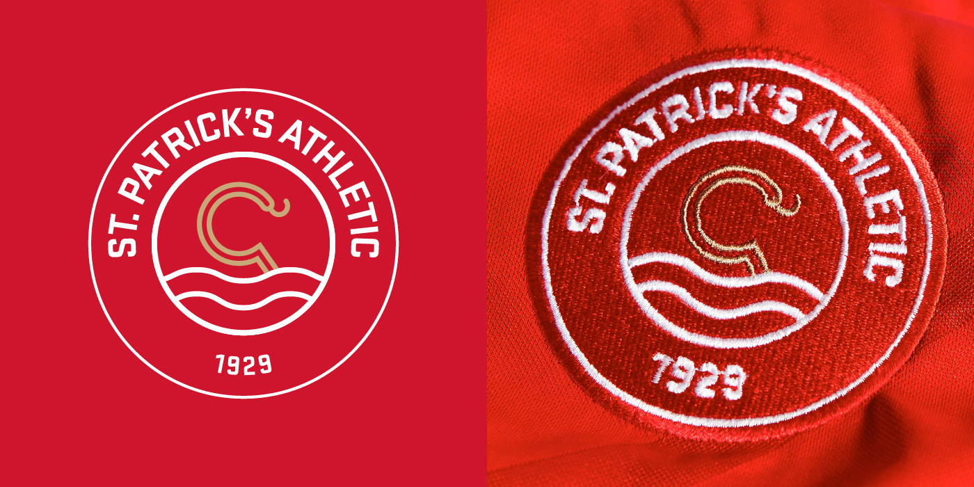
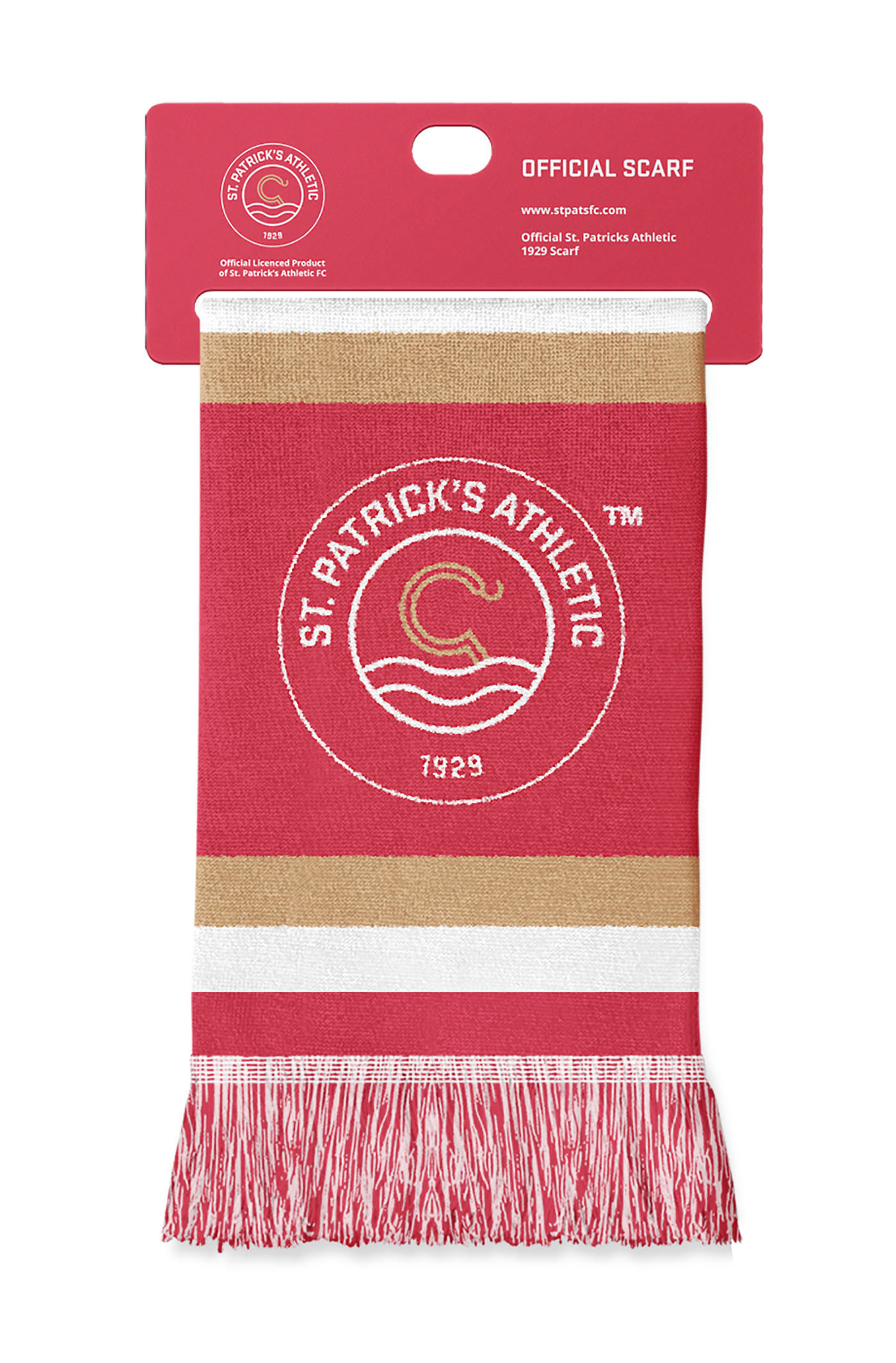
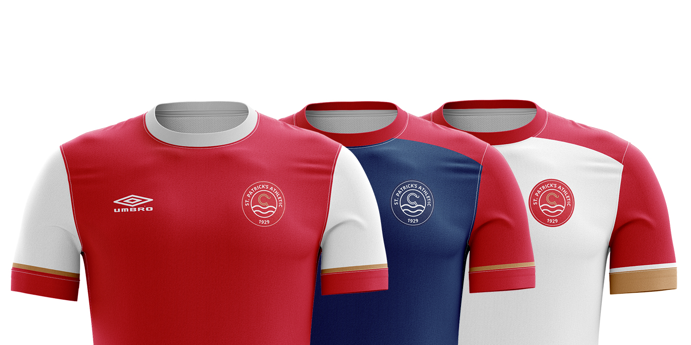
A challenge faced by football clubs is designing a crest which communicates the characteristics and values of the club while meeting modern design standards. I developed a new St. Patrick’s Athletic crest which retains the tradition and heritage of the club's previous crests using symbols which have made up the crest for the past 100 years. The circular shield, the staff of Saint Patrick and the waves of the Camac river are maintained in the new design. Stratum has been chosen to replace the old typeface—giving the new crest a more distinct feel, while the new staff of Saint Patrick is made up of geometric circles, adding to the overall scalability of the new crest.
