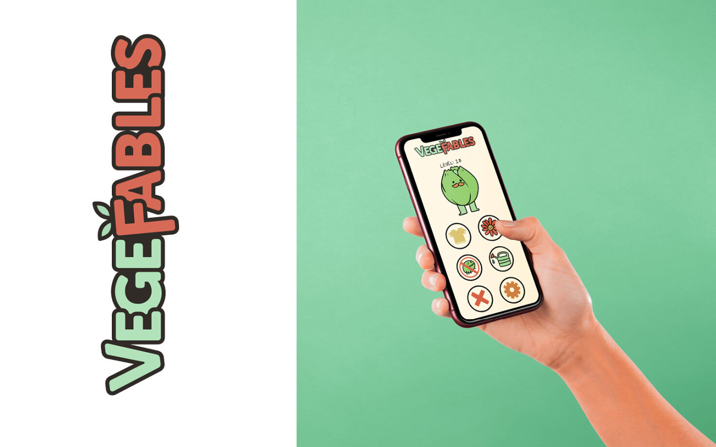
Vegefables
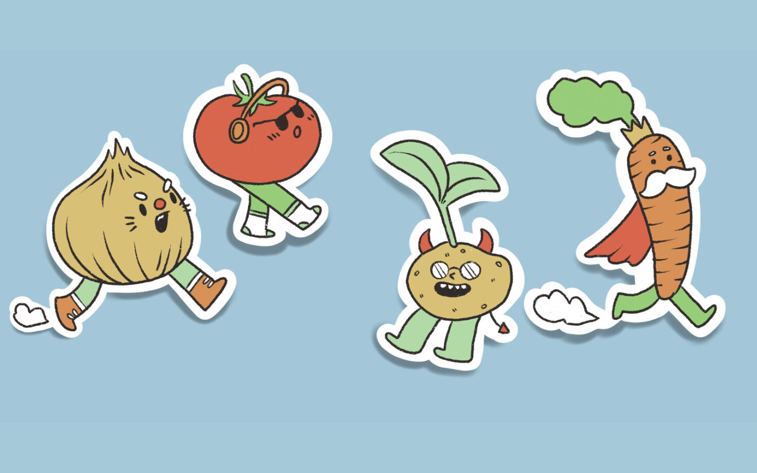
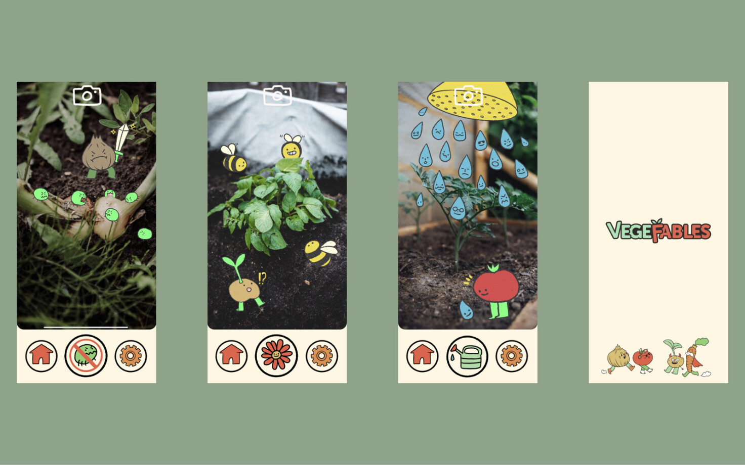
Combining Augmented Reality technology with design to form a unique learning experience was the main goal of this project. Vegefables is an app to help children grow and learn about vegetables and plants. It was important to me to make self-sufficiency fun and interactive. Although there are many projects and campaigns already focusing on home gardening, I’ve noticed that the raw information gets jumbled and is a bit difficult to navigate for first-time growers. Users could use the cameras on their phones to grow plant friends as their plants grow in real life as well. Customise and unlock achievements as you water your plants and learn about growing plants at home. I saw an opportunity to use my illustration skills to give character and emotion to these ideas. As well as this, a design identity had to be made that was friendly towards children of a younger age too. Drawing from initial sketches gave me a new idea as well. The app could also use the tracking capabilities of AR to paint plants and scenes around a room. This would build an interactive space with the plants you grow in the app.
This project was a good way of exercising my expertise in building a coherent brand. Separate from the core idea a strong visual identity can push a project very far. The relationship between colour, layout and style was quite important here. How illustration interacts with other design elements is very important. I attempted to develop an identity that was consistent with the message and idea I was trying to show. I’m glad I had the opportunity to explore these themes in this project.