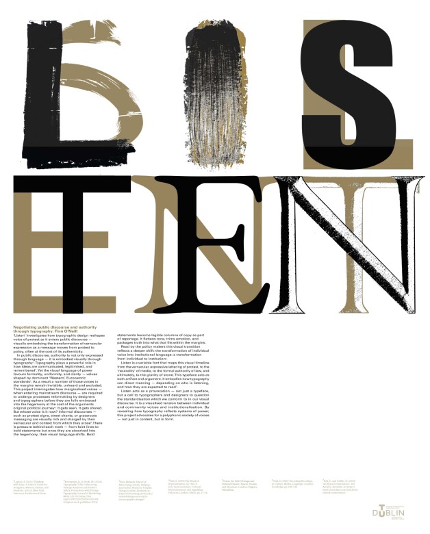
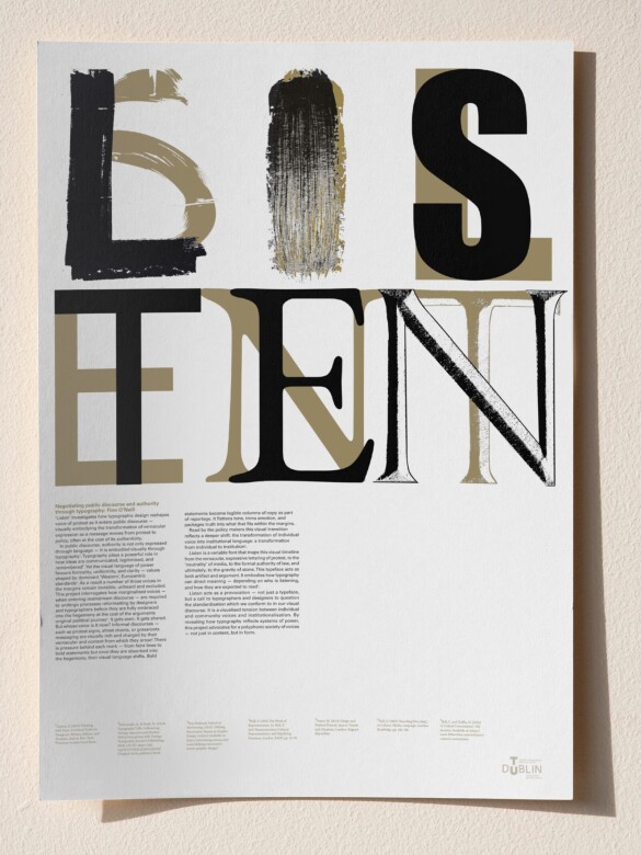
I’m a Dublin-based designer and strategist with a strong interest in how systems shape the way we learn, communicate, and collaborate. My work sits at the intersection of design research, education, and critical thinking, exploring how communication can support both understanding and change.
My approach is inquisitive, adaptable, and grounded in real-world impact. I see design not just as a visual tool, but as a means of visual articulation and education by making systems clearer, ideas more accessible, and learning more engaging.
During my time at TU Dublin, I’ve explored how design works in real world contexts. From facilitating innovative education programs to co-managing an education startup, designing a youth mental health campaign with SpunOut.ie, and presenting my research at an international conference.
I’m drawn to roles that combine design, research, and learning, where creativity meets responsibility.
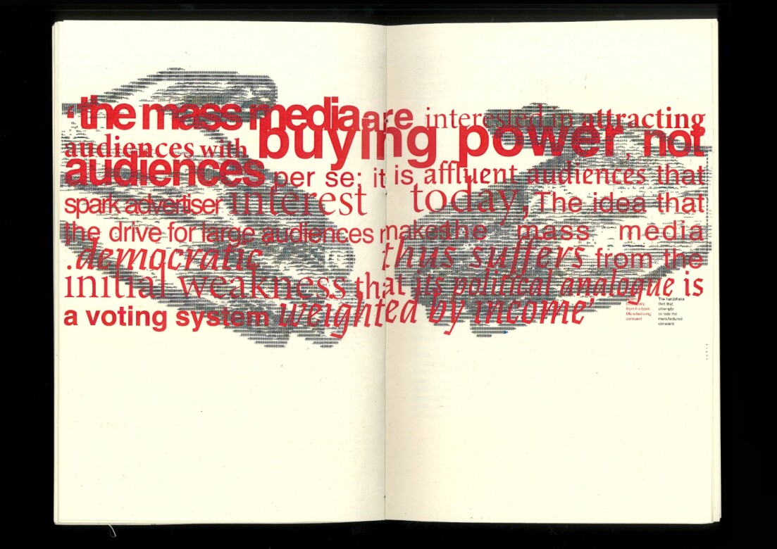
Listen investigates how typographic design reshapes voice of protest as it enters public discourse — visually embodying the transformation of vernacular expression as a message moves from protest to policy, often at the cost of its authenticity.
Listen is a variable font that maps this visual timeline from the vernacular, expressive lettering of protest, to the ‘neutrality’ of media, to the formal authority of law, and ultimately, to the gravity of stone. This typeface acts as both artifact and argument. It embodies how typography can direct meaning — depending on who is listening, and how they are expected to read.
Listen acts as a provocation — not just a typeface, but a call to typographers and designers to question the standardisation which we conform to in our visual discourse. It is a visualised tension between individual and community voices and institutionalisation. By revealing how typography reflects systems of power, this project advocates for a polyphonic society of voices — not just in content, but in form.
This project explores how truth becomes fragmented in algorithmic media environments, where spectacle is rewarded over substance. The result is a population increasingly mobilised by grievance and detached from material realities.
Through critical reflection and typographic intervention, this work draws a comparison to Filippo de Strata's 15th-century polemic against printing. De Strata's concerns, presented to the Doge of Venice, mirror modern concerns about the dissemination of information, highlighting the danger of technological advancement on the preservation of intellectual integrity.
The book connects incunable typography with modern communication by pairing a contemporary Fraktur typeface with modern serif and sans-serif choices. This typographic system draws a parallel between historic and contemporary modes of ideological control. Historic being that of the incunabula (infancy of printing). Typography is layered, oversized, and distorted to visually articulate headline-driven clickbait culture.