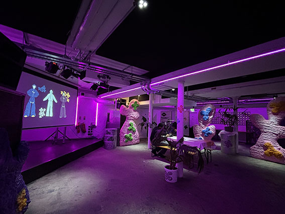
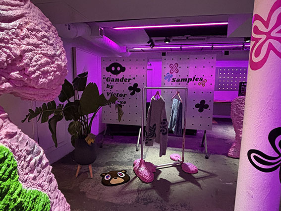
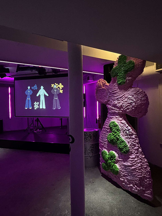
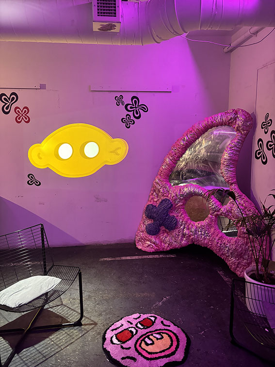


Gander has always been a personal project that I've wanted to release, now is the time. As visual merchandisers, we have put ourselves in a box to primarily window displays, but our skills are much broader. Times are changing, and that is something I aimed to show with this project.
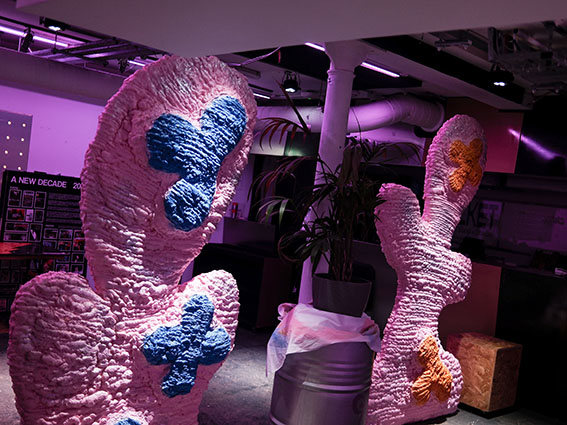
Influenced by the WGSN S/S 24's Sense scape sub trends: Bubble-gum and Synaesthesia. Bubble-gum, encompasses organic shapes, jelly-like forms, and patterns, equally Synaesthesia encompasses shapes, colours, and textures; these were the perfect fit for the brand.
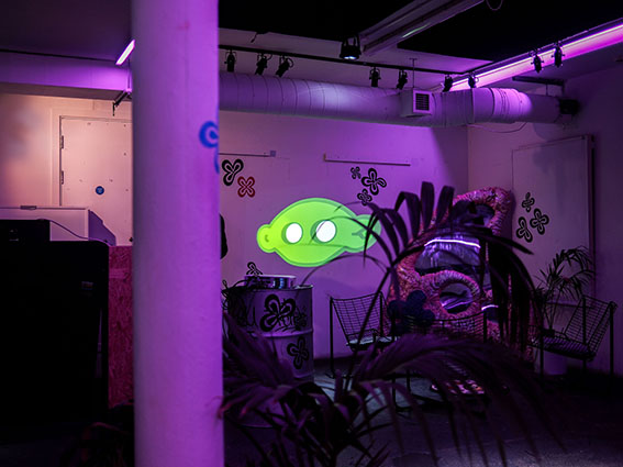
To synthesise "Ganders" ethos, merging the physical with the digital, I created the organic look using expanding foam, mirrored Perspex, spray paint, insulation foam, and card. The digital was born using Procreate (Digital Illustration), Adobe After Effects (Visual effects/motion graphics), and Clo3d (Digital Fashion Design).
I created a phygital space to embody Gander. The ambience was exactly right. Visual Merchandising is not just window display.