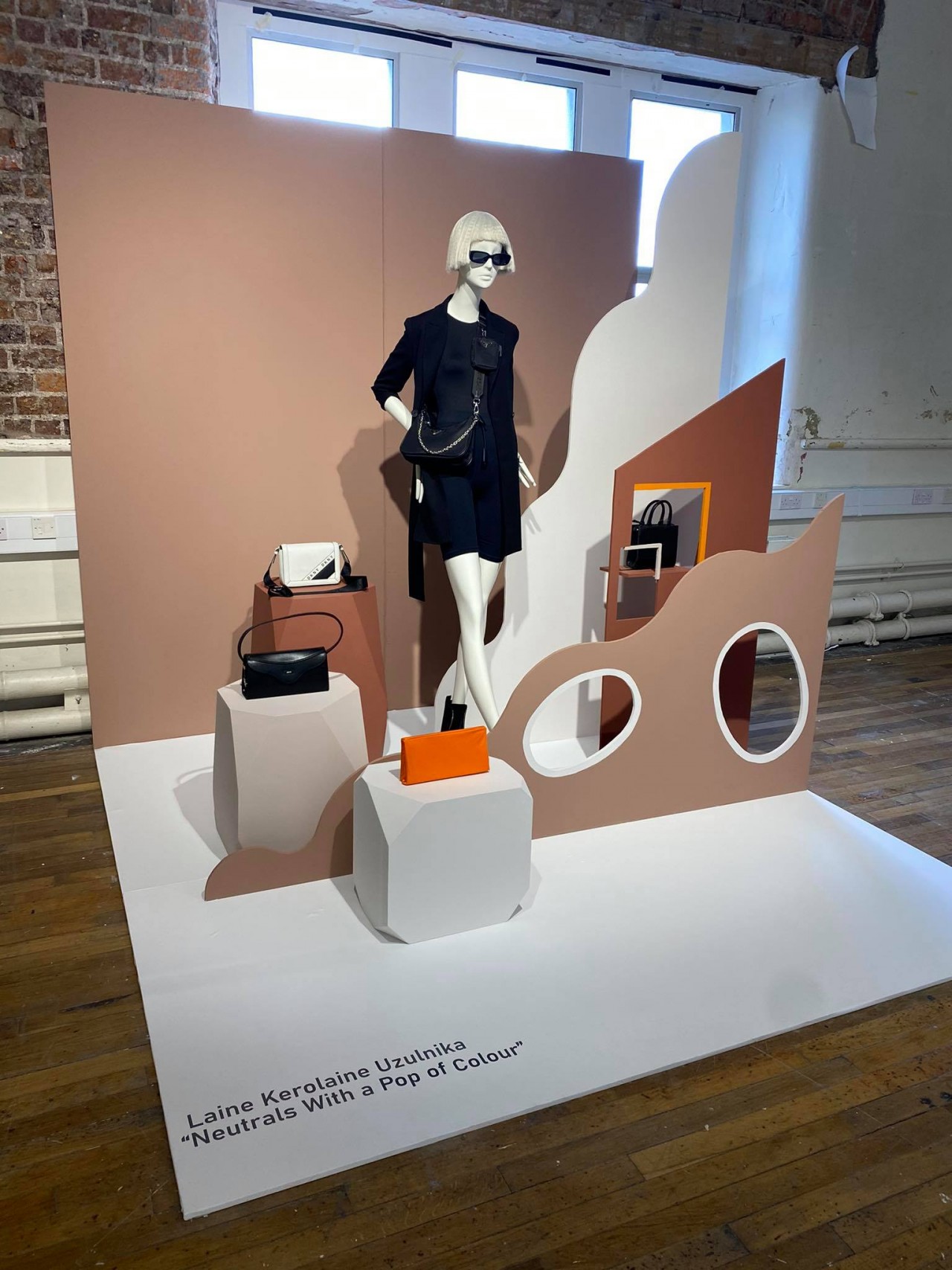
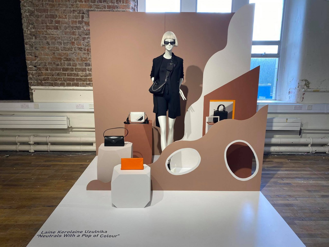
Laine Kerolaine Uzulnika
Project 1: Neutrals with a pop of colour
There were no creative restrictions on our designs for the Major Project, but we had to create a window display that would suit our placement's target market. I was inspired by the concept of the 'HomeSpun' theme on WGSN for my Major Project for Kilkenny. I think that this concept suits the Kilkenny store, as it is suitable for the target market. It uses neutral colours, which are on-trend at the moment. I added pops of orange throughout the display to make it more exciting and eye-catching. I kept the styling quite casual, as I wanted the focus to be on the colour of the dress and the merchandise that was placed on the plinths, as Kilkenny is heavily focused on selling wellness products and bags at the moment.


 Home
Information
Archive