Visual Communications
Murray Aston Joseph Barnes Jodie Byrne Finan Callaghan Tom Campion Áine Coll Kate Doherty Lily Gartner Chris Hanna Aoibheann Hand Bartek Janczak Kayley Kemple Shauna Langtry Megan McDonnell Marianna Mooney Póilín Nic Géidigh Caitlín Ní Rabhartaigh Lana O'Kiersey Karolina Olkowicz Gary Price David Rogers Laura-Ann Ryan Stephen Sheehan Sun YuyuLaura-Ann Ryan
Heinz—The Everyday Treasure
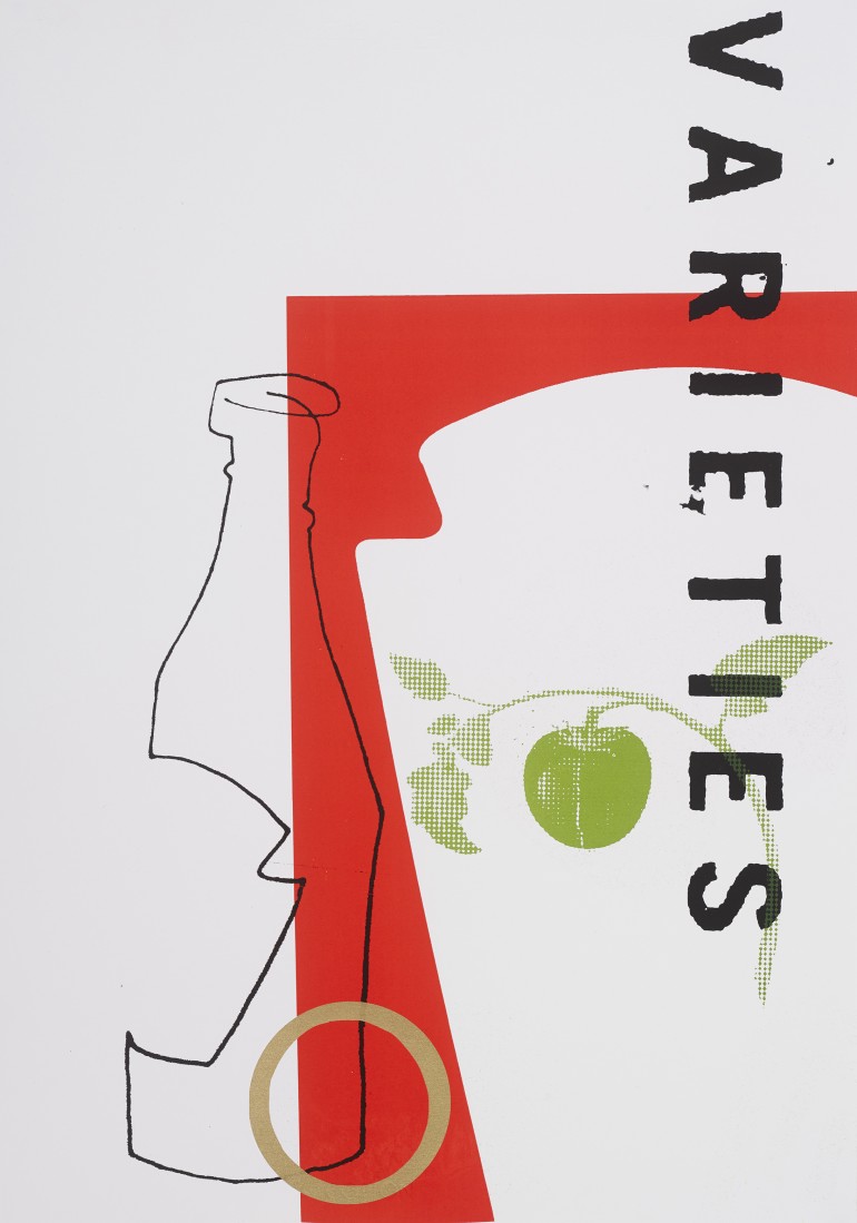
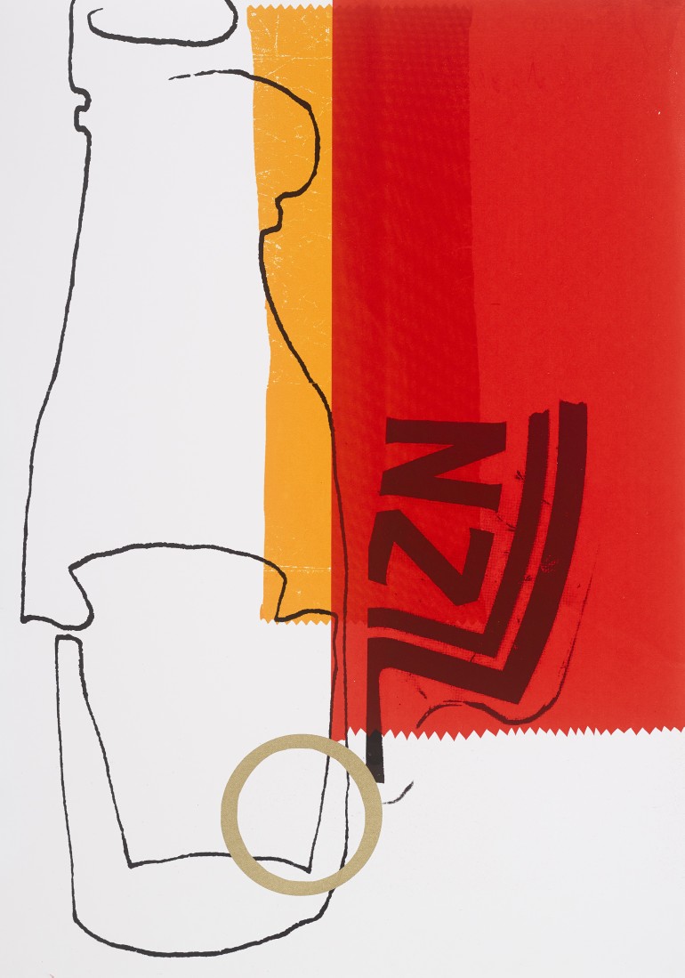
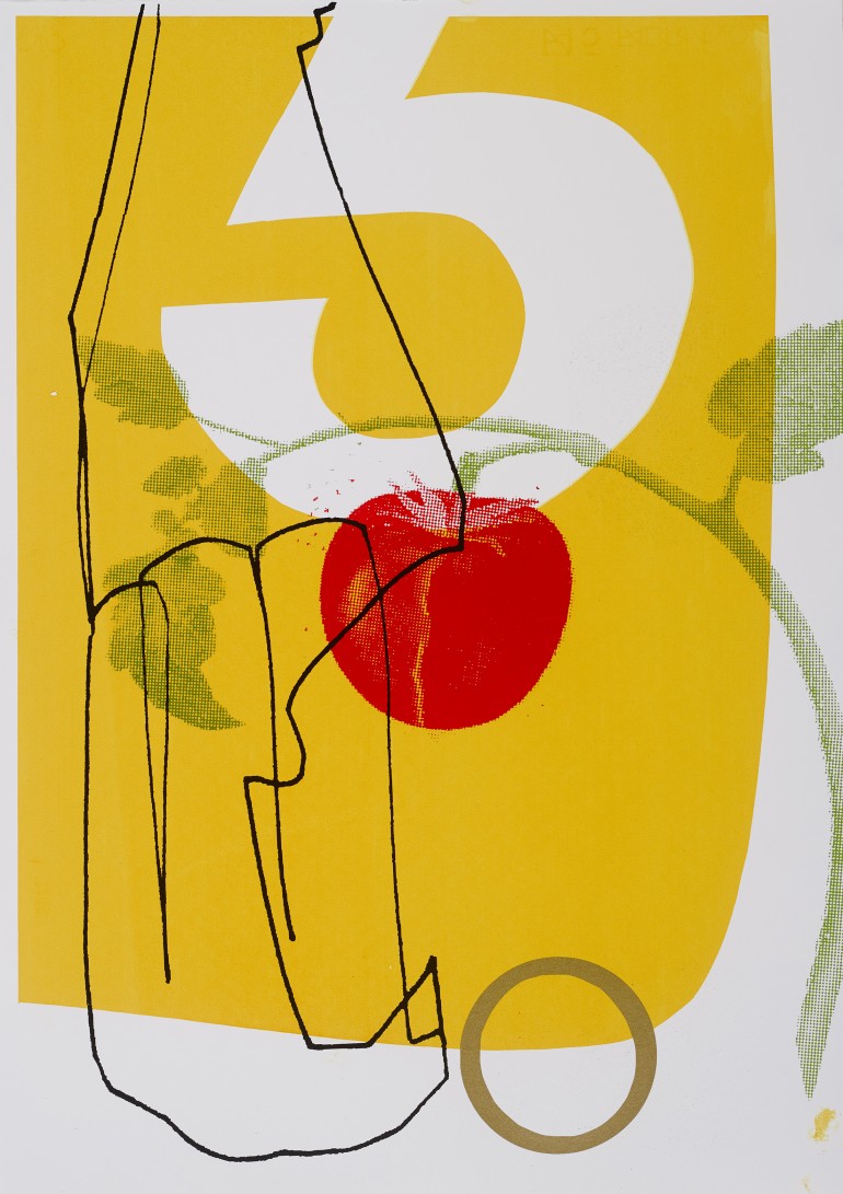
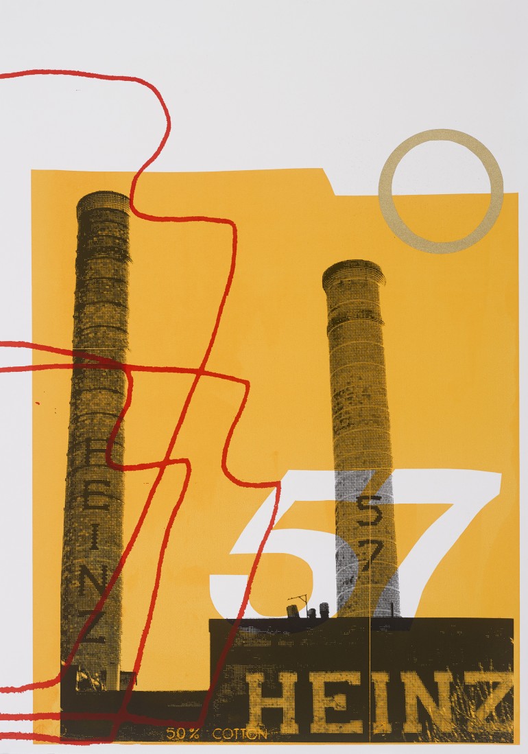
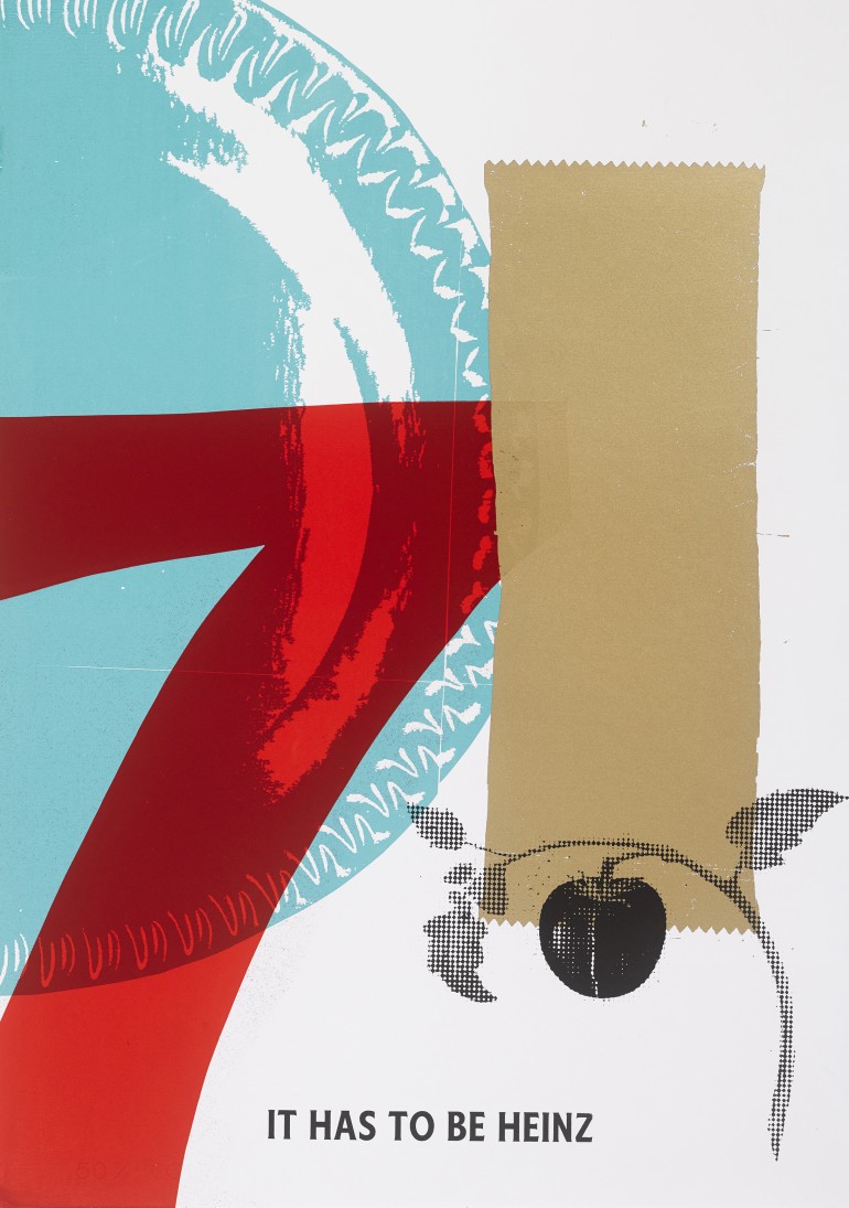
Heinz Ketchup, one of the world’s best loved brands is everywhere, and is part of the most enjoyable moments of our everyday. However, as a condiment, it tends to lean into the background–never quite becoming the main event. As the brand reaches the ripe old age of 150 years, it is time for this everyday treasure to be valued and elevated as a precious object in its own right, by making it the focus of a series of portraits celebrating the inimitable features that make this brand so beautiful: the label, its distinct lettering and numerals, the iconic number '57', the moulded, patterned imprint on the base of the bottle, the curl of the green leaf as it cups a single tomato–all framed with a ribbons of soft gold to trim it off.
Hence, I have produced a limited edition of hand-pulled screen-prints using the distinct imagery, colours and shapes that have built the brand. The objective here was for this much-loved and familiar part of our everyday lives to be portrayed in a way that gives the audience an opportunity to view something that they have grown up with in a new light, re-appraising the bottle and the brand anew–ready for the next 150 years to come.
l.a.ryan.design@gmail.com
https://lauraannryan.myportfolio.com
