Rachel Finnegan

Rachel Finnegan is an Irish/American creative with a keen focus in branding and identity design. Delivering bespoke solutions rooted in craft, usability, creativity, & aesthetics. Rachel is a designer with a background in beauty, working as an artist for MAC Cosmetics and Bare Minerals. She has recently gained experience in interior design solutions working alongside an NYC sub-contractor company. Rachel’s background in beauty, visual merchandising, graphic, and interior design is motivated by a desire to provide the highest standard of integrity, honesty, and professionalism to her designs.

Daughtering

“The 17th-century proverb ‘My son is my son till he gets him a wife, but my daughter's my daughter all the days of her life.’ still rings true according to new research by SUNY Geneseo professor of communication Meredith Harrigan and Allison Alford.” In this study researchers found, daughters are frequently overlooked and unexamined, and, in turn, perform invisible labour.

As a participant and observer of daughtering, behaving dutifully is the action of a female child, caring for others. This internalised role informs women of the requirements of their birthright, to be caregivers and nurturers for others. Of all the roles women are required to fill in this society, daughterhood is universal. Being born, every woman is another woman’s daughter. The research shows that the “language” of daughtering is almost non-existent in social discourse as well as in scholarly or popular works. For example, a daughter who is caring or supportive is often described as being “motherly.”

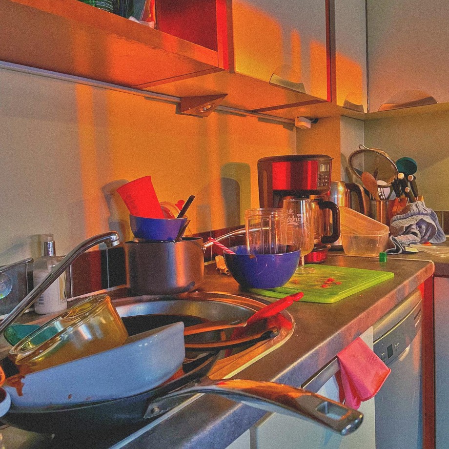
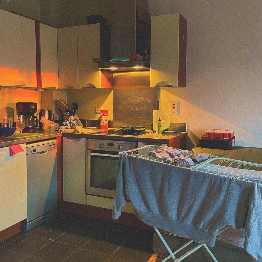
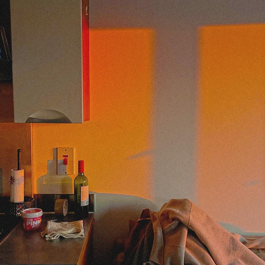
This installation explores what it feels like to experience the emotional labour of being a daughter in adult years. By using the vehicle of photography and sound, this project captures the mundane tasks of a daughter's life, displaying the non-deal moments of the beauty and complexity of a daughter’s handling of routine.

This installation is displayed by a projector, to enhance how people will perceive the content. The projection is cast onto fabric, the textured canvas allows the viewer to view the photography with movement. Lit by images projected onto the fabric, photography is animated by a soundscape of dutiful sounds of cleaning, cooking, rushing, and telephone calls.

The photography is uniformly taken in 1:1 ration square form. This aspect ratio nods to the square format as seen on social media posts, particularly on Facebook and Instagram. The photos will display non-ideal moments and capture the reality of the daughter’s perspective. This is conjured in a series of point-of-view shots, displaying the subtle handling of daily life which is a deeply personal journey. The point-of-view focuses on the eldest daughter & only daughter of a household.

Working on this project and engaging in this novel topic was exciting to explore yet challenging to describe. This installation aims to highlight this specific feeling half the population faces during and after their formative years, as a daughter.

Reverie Scotch

The new ‘sister’ whisky brand from Chivas Regal. Reverie Scotch is a new range of premium blended scotch whisky from the Strathlisa Distillery designed to push the boundaries and challenge the outdated perception that whisky is a man’s drink.

The identity for this new brand is reflective in its name, reverie meaning daydream; to be completely lost in one’s thoughts. The word reverie served as an interesting starting point for development. Inspired by the state of mind and euphoric feeling of winding down with a glass of whiskey, the brand identity strives to convey a sense of luxury when refinement, tradition, and contemporary design and values are combined.

The Reverie Scotch woman is introspective, brave and intelligent enough to know her strengths and weaknesses. She acts to maximize her strengths and minimize her weaknesses. The sexist culture of “men only” or “be sexy” to sell whisky - needs to change from the inside. Reverie Scotch doesn’t want “girly pink whisky”, instead of branding that truly represents female whisky drinkers: smart, bold and lavish.

Reverie Scotch aims to create a bespoke bottle inspired by the Scottish Highlands & national animal, the unicorn. In Celtic mythology, the unicorn was a symbol of purity and innocence, as well as masculinity and power. This juxtaposition serves as the descriptor for the overall brand essence.

Type is modernly set, to challenge what it means to be a whisky drinker. Whisky is often rooted in tradition and heritage. Reverie Scotch’s logo combines modern minimalist design with tinted gold leaf. Gold leaf This dates as far back as ancient Egyptian times seen in relics and artefacts from that period. Nothing compares to the rich warm glow of gold leaf shimmering on an object. To signify the idea of a blended whisky which is all about marrying different flavours and textures the gold leaf is tinted a specific colour (red, blue, green) to signify the different blends of whisky. These include notes of cinnamon, pear, vanilla vs. chocolate, orange, and butterscotch.

Women in the UK now drink 40 million more glasses of whisky a year than they did in 2010, a rise of 15%, compared with a decline of 6% among men, according to the market research firm Kantar according to the article in The Guardian. Taping into the market that seems to be left behind in terms of branding will help future-proof a new generation of women who drink whisky. Women nowadays have a good scene of different notes and flavours, which is why Reverie Scotch Whisky will be successful for years to come.