Jane Battersby

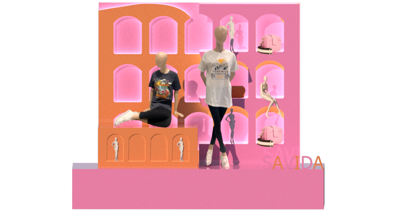
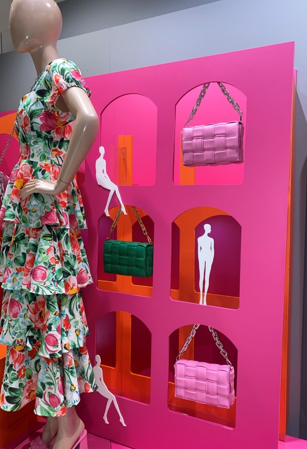
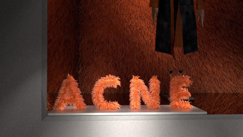
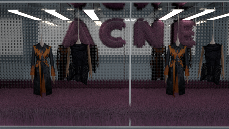
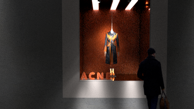
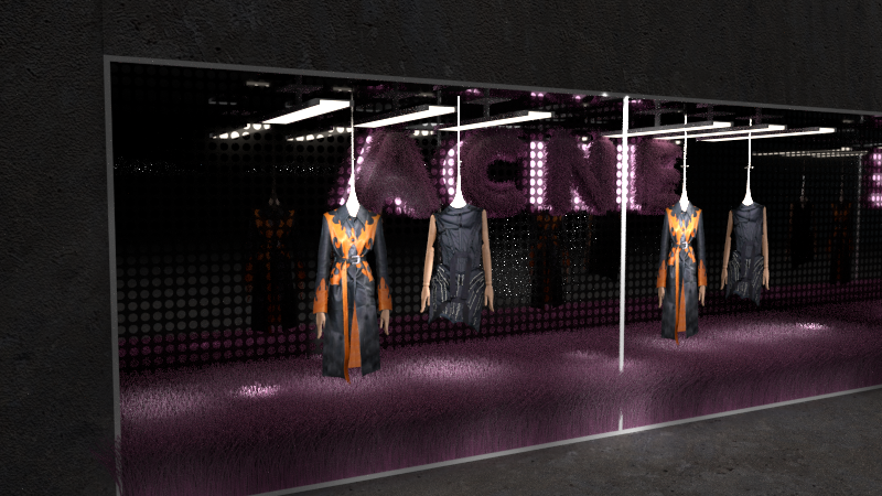
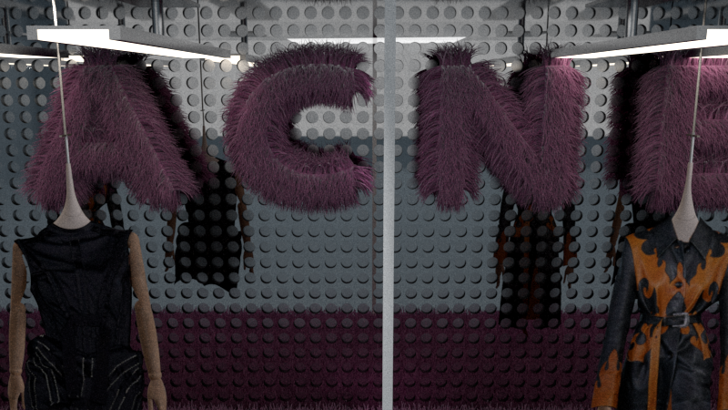
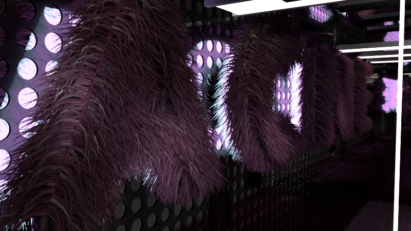
My name is Jane Battersby and I am a Third Year Visual Merchandising and Display student in Technological University Dublin. I will be completing my B.A in June 2022 and I am looking forward to using to knowledge and skills which I have gained during my last three years as a student in TU. Despite facing many difficulties while studying during the pandemic with the help and support of my lectures and fellow students we overcame them and thrived. I was lucky enough to be able to undertake Visual Merchandising internship in Dunnes Stores a leading Irish retail company. I trained in one of their major Dublin stores where I was exposed to all elements of Visual Merchandising from the small to the major projects. I was lucky enough to meet some of the head buyers for Dunnes Stores where I was able to discuss upcoming trends and gained knowledge to plan and design and execute my major project installation in the store. Since we were a small close group of students, we were able to collaborate as a group and support each other on individual projects. I have thoroughly enjoyed this course and would recommend it to any student who is creative and relishes a challenge.

Arches by Design

I based my design on the WGSN Spring/Summer 2022 trend Euphoric for my final year installation in Dunnes Stores Blanchardstown. Euphoric explores the power of design to boost moods and encourage positivity.

My chosen design is named Arches by Design. I wanted to create an installation that would let the customer use their imagination and get excited to travel, whether on a city break or to travel abroad. While researching, I was drawn to Roman architecture, which features arches in many countries in Europe and beyond, so I wanted to make them a focal point in my design. In 2022, consumers are yearning for release through escapism and ebullience, and they will be seeking designs and experiences which enable this.

I also researched the Visual Artist Kim Mijoo who uses fantastic colours which tie in with The Colour Me Happy concept on WGSN. This concept is simple, colourful, and playful, so I wanted to use simple shapes and joyful colours. The Savida collection in Dunnes Stores combines bright colours with vibrant patterns, so I believe ideal for conveying The Colour Me Happy concept. My styling focused on the colours Magma Orange and Pink Guava from WGSN, which also featured in the Savida Eva collection. I designed mini mannequins to create a playful element in my design.

My design space was quite challenging as I had to create an eye-catching design that had to be free-standing. I was pushed out of my comfort zone and had to adapt my design without using any suspension as I did not have a window space. I trialled various materials, including MDF, plywood, and Foamex. I chose Foamex as my primary material as it gave the most professional finish. I first drew up my design on Sketch-up and then exported the file to CorelDraw, and then cut out my design using the CVC machine. I used illustrator to draw up the designs for the mini mannequins and cut them out using the laser cutter. As a result of this project, I have gained more confidence using various design software and machines. I also have honed my skills, resulting in professional finishes on my props.

Faux Metal

This project was from my Fashion & Branding Module in 3rd year. We were each given the task of investigating a brand of our choice. Our chosen brand needed to be researched in-depth regarding its history, values, and target market. With this research in mind, a three-dimensional rendered model of a window installation was required to be designed for the brand’s flagship store, along with a rollout window launching their Spring/Summer 2022 collection.

My chosen brand was Acne Studios. The Acne Studios fashion house was founded in Stockholm in 1996. The name Acne stands for ‘Ambition to create novel expression.’ It is part of their creative collection which focuses on graphic design, film, production, and advertising. Acne is a famous fashion house worldwide that operates in the luxury market. The brand is known to convey a laid-back lifestyle and not care too much about data but more about creating truly desirable products that reflect the company’s passion. Acne likes each store to have a minimalistic effect and show that each store is different and individual but shares the same industrial feel. I admire this element and brought it into my design. The interior must be attractive to the customer, not just a place to purchase clothes but to feel inspired. Jonny Johanson uses fabric to create oversized layering pieces with exaggerating proportions and forms. Acne is synonymous with leather products, especially their jackets. Leather has appeared in every collection. My design is a homage to their use of leather products in their fashion. One of the artists who inspired my design is Eduard Eremchuck, a Russian architect and designer who has used pink furry walls and vibrant yellow surfaces.

My research into my chosen idea identified ‘Industrial Minimalism,’ which is the central theme in Acne Studios stores. I included some of the Acne Studios Milan Store features in my design. Acne Studios rarely use traditional forms of display or mannequins; they opt for minimal display techniques focusing more on their products than the surroundings. I was also inspired by ‘Coloured Paper Installation’ by Travis Rice.

I also was influenced by one of the feature walls in The Tokyo Superguide Store. Acne Studios regularly combine local culture and architecture in their stores.